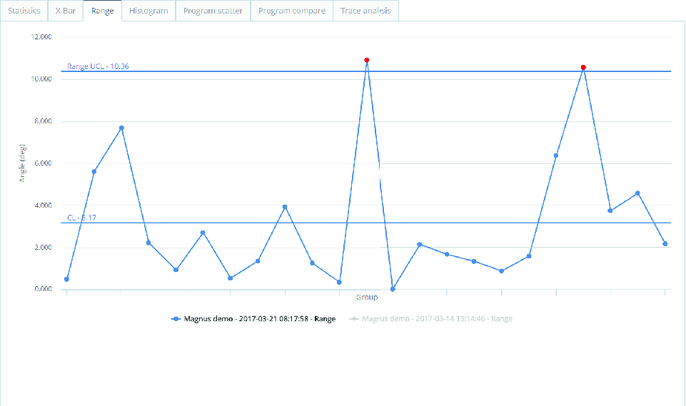
Range Tab
The Range tab graph displays the range chart of the selected program. A range chart plots the process range (difference between highest and lowest value) over time for the selected groups.
Plots will be marked red if they:
are outside the upper control limit (UCL) or lower control limit (LCL).
show 7 or more consecutive increasing or decreasing plots.
show 7 or more consecutive plots above or below average.